

Blast Off with Blazor: Add a shared dialog component
In this post, we add a dialog to get a closer look at our images.
So far in our series, we’ve walked through the intro, wrote our first component, dynamically updated the HTML head from a component, isolated our service dependencies, worked on hosting our images over Azure Blob Storage and Cosmos DB, built a responsive image gallery, and implemented prerendering, and built a search-as-you-type box.
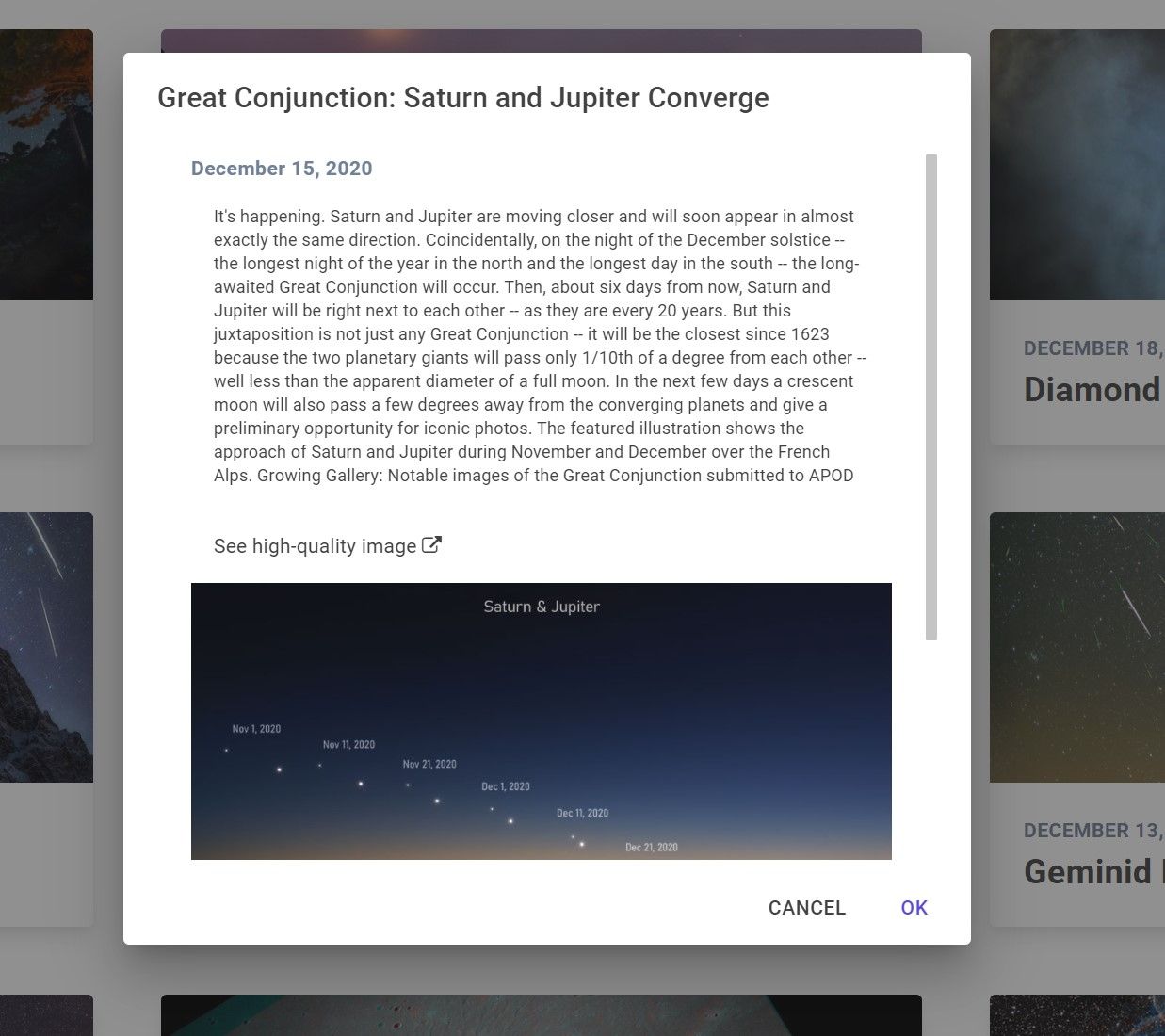
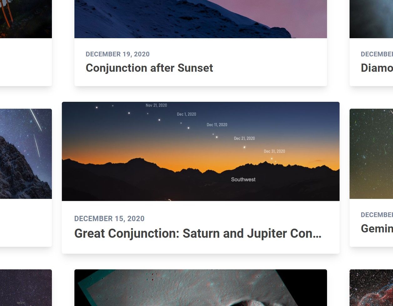
With our card layout all set and searchable, we can now build a shared dialog component. In this dialog, users can click a card to get more details about the image. The dialog will display the title, date, an explanation, the photo itself, and a link where users can open the image from my public Azure Blob Storage container.
While building a dialog yourself seems straightforward, many nuances can make it a pain to write yourself. You’ve got to apply CSS effects (like dim the background when it’s opened), make it scrollable, have it adapt to multiple screen sizes, allow keyboard input (like closing the dialog when you hit the Esc key), and so on. While there are many great options out there, I decided to use the MudBlazor component library.
Let’s get started. As always, my project is out on GitHub.
Install and configure MudBlazor
To install MudBlazor, I ran the following dotnet CLI command from my BlastOff.Client project:
dotnet add package MudBlazor
To prevent manual imports across the component files, I added a single @using at the bottom of my _Imports.razor file.
@using MudBlazor
Then, in Program.cs in the BlastOff.Client project, add the following services:
using Microsoft.AspNetCore.Components.WebAssembly.Hosting;
using Microsoft.Extensions.DependencyInjection;
using System;
using System.Threading.Tasks;
using MudBlazor.Services;

namespace BlastOff.Client
{
    public class Program
    {
        public static async Task Main(string[] args)
        {
            var builder = WebAssemblyHostBuilder.CreateDefault(args);
            builder.RootComponents.Add<App>("#app");

            // other stuff not relevant to this post

            builder.Services.AddMudServices();
            builder.Services.AddMudBlazorDialog();

            await builder.Build().RunAsync();
        }
    }
}
In the project’s wwwroot/index.html, add MudBlazor’s CSS in the <head> tag and its JS before the end of the <body> tag. (By the way, this is all in the MudBlazor documentation.)
<!DOCTYPE html>
<html>
    <head>
        <!-- Condensed <head> -->
        <link href="BlastOff.Client.styles.css" rel="stylesheet">
        <link href="_content/MudBlazor/MudBlazor.min.css" rel="stylesheet" />
    </head>

    <body>
    <!-- Condensed <body> -->
    <script src="_framework/blazor.webassembly.js"></script>
    <script src="_content/MudBlazor/MudBlazor.min.js"></script>
    </body>
</html>
To complete MudBlazor setup, add a MudThemeProvider and MudDialogProvider component in the Shared/MainLayout.razor file. You’ll notice I can also pass global dialog parameters, like FullWidth and MaxWidth.
@inherits LayoutComponentBase
<NavBar />

<div>
    <div class="section columns">
        <main class="column">
            <MudThemeProvider/>
            <MudDialogProvider
                FullWidth="true"
                MaxWidth="MaxWidth.Small"/>
            @Body
        </main>
    </div>
</div>
Add the shared dialog component
With MudBlazor set up and configured, let’s add a new dialog component in Shared/ImageDialog.razor.
In the @code block, we first need to wire up Submit and Cancel events. The Submit will be bound to a simple Ok dialog result, and the Cancel will assume the default behavior. MudBlazor passes down a CascadingParameter of a MudDialog. I’m also passing down ImageDetails as a parameter containing the data I’m using to populate the dialog.
@code {
    [CascadingParameter] MudDialogInstance MudDialog { get; set; }
    [Parameter] public Image ImageDetails { get; set; }

    void Submit() => MudDialog.Close(DialogResult.Ok(true));
    void Cancel() => MudDialog.Cancel();
}
In the markup, the ImageDetails model will live inside a MudDialog and the associated DialogContent and, finally, a MudContainer. After some simple Tailwind CSS styling, I’m using ImageDetails properties to populate my dialog.
<MudDialog>
    <DialogContent>
        <MudContainer Style="max-height: 500px; overflow-y: scroll">
            <div class="text-gray-600 text-md-left font-semibold tracking-wide">
                @ImageDetails.PrettyDate
            </div>
            <div class="text-xs p-4">
                @ImageDetails.Explanation
            </div>
            <div class="p-4">
                <a href="@ImageDetails.Url" target="_blank">See high-quality image <i class="fa fa-external-link" aria-hidden="true"></i></a>
            </div>
            <img src="@ImageDetails.Url" />
        </MudContainer>
    </DialogContent>
    <DialogActions>
        <MudButton OnClick="Cancel">Cancel</MudButton>
        <MudButton Color="Color.Primary" OnClick="Submit">Ok</MudButton>
    </DialogActions>
</MudDialog>
Add dialog to ImageCard
With the shared dialog created, now let’s add it to our existing ImageCard component. For the markup, we can inject an IDialogService and also bind an OpenDialog function to an @onclick event.
@inject IDialogService DialogService
<div class="image-container m-6 rounded overflow-hidden shadow-lg"
     @onclick="OpenDialog">

    <!-- All the existing markup -->
</div>
The @code block includes the ImageDetails as a parameter to send to the dialog. Then, in OpenDialog, pass the ImageDetails into DialogParameters, and show the dialog.
@code
{
    [Parameter]
    public Image ImageDetails { get; set; }

    private void OpenDialog()
    {
        var parameters = new DialogParameters {{"ImageDetails", ImageDetails}};
        DialogService.Show<ImageDialog>(ImageDetails.Title, parameters);
    }
}
Bonus: Use CSS isolation for image card hover effect
I added a hover effect, where image cards get just a little bit bigger as you hover over them. It’s a simple and subtle way to tell users, Hey, you can click on this.
I’ve written a few times about Blazor CSS isolation. You can check out the links for details, but it allows you to scope styles to a specific component only.
To do this, I created an ImageCard.razor.css file. The style makes the image card 10% bigger on hover.
.image-container:hover {
    transform: scale(1.10)
}
Mission complete!
Wrap up
In this post, we used the MudBlazor component library to create a shared dialog component. We showed how to install and configure the library, create the component, and add it to our existing solution. As a bonus, we used CSS isolation to apply a nice hover effect.